project overview
Phase Skincare
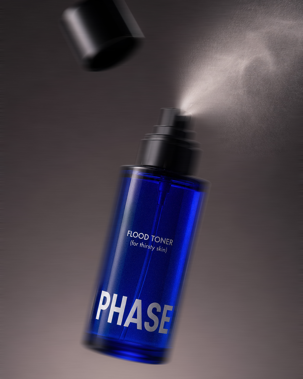
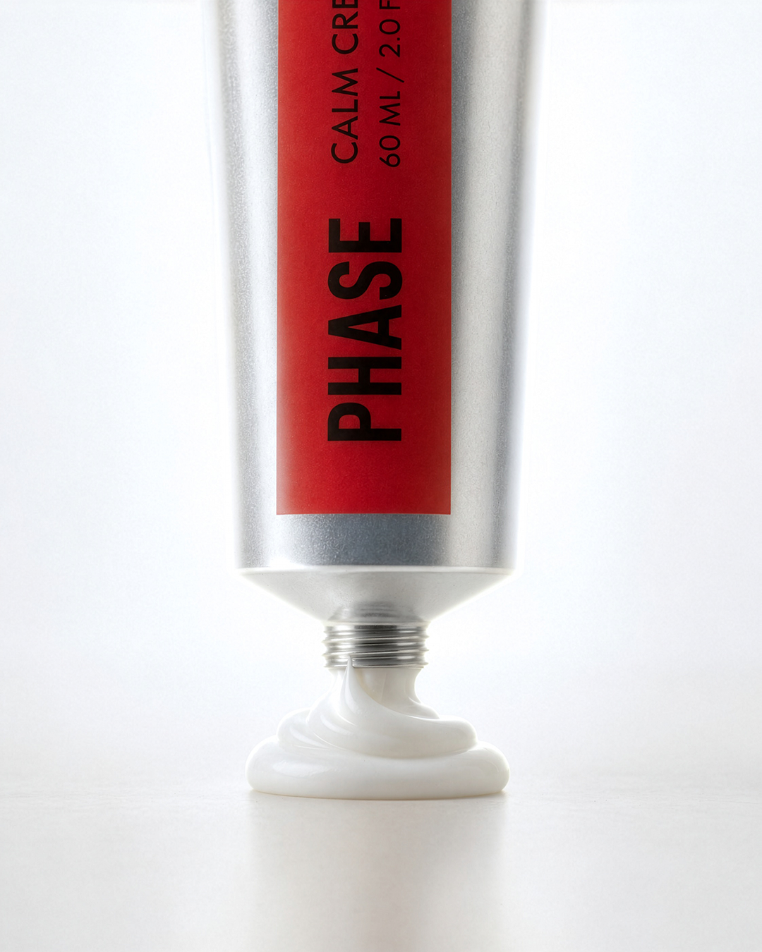
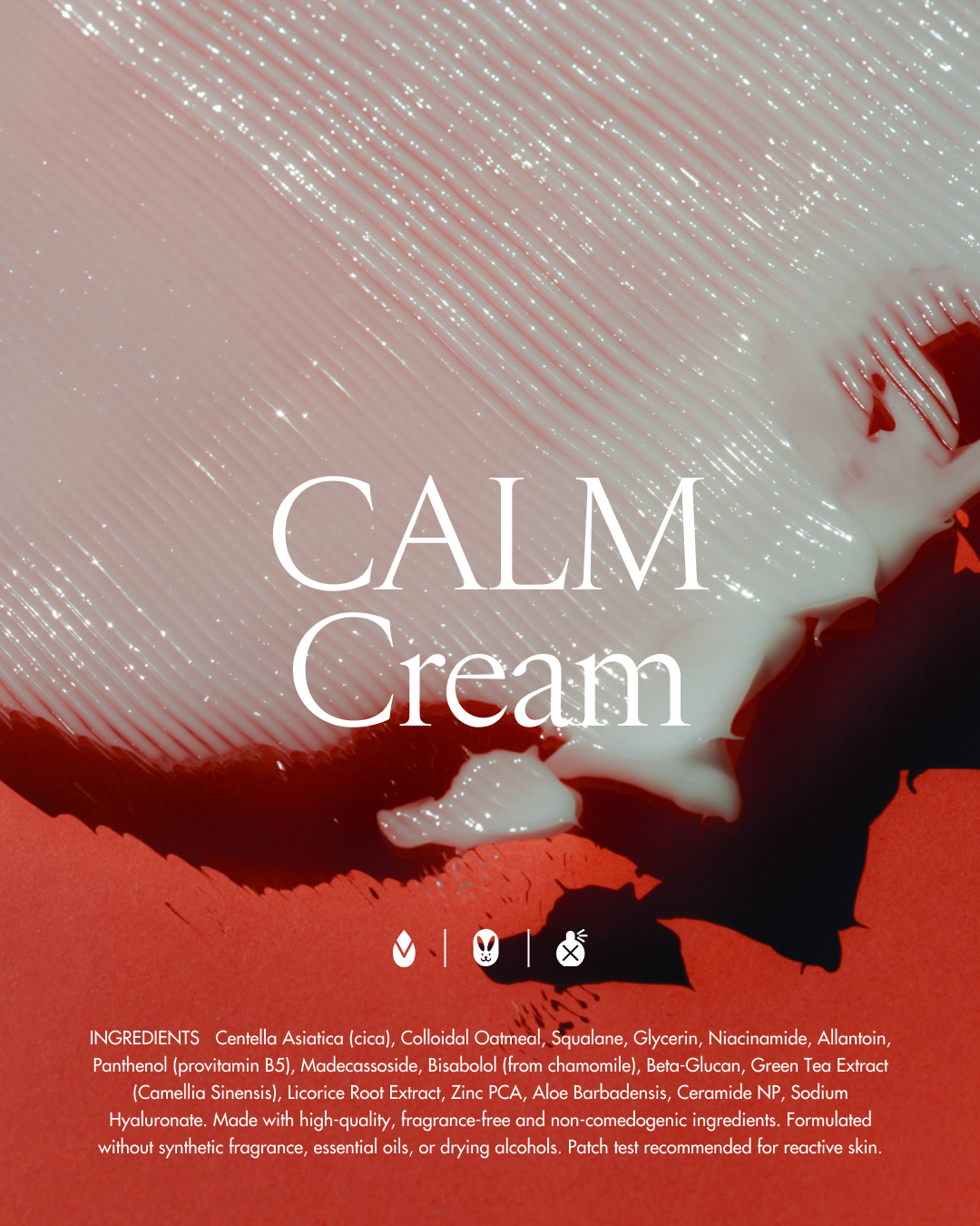
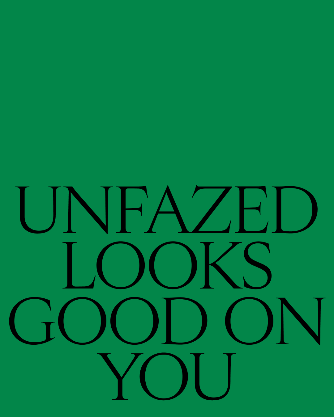
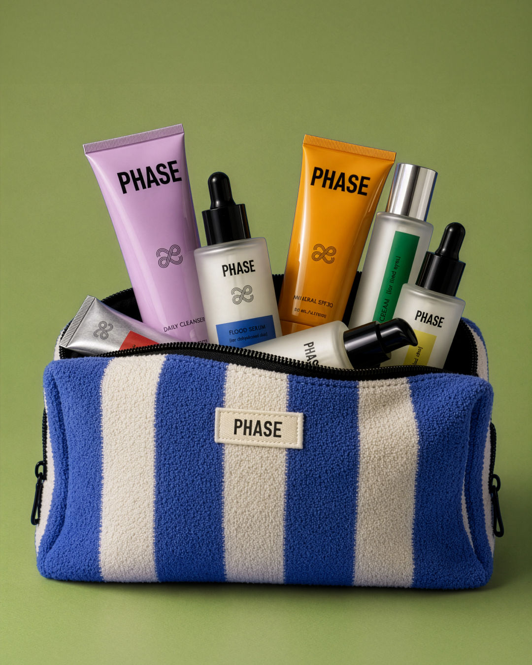
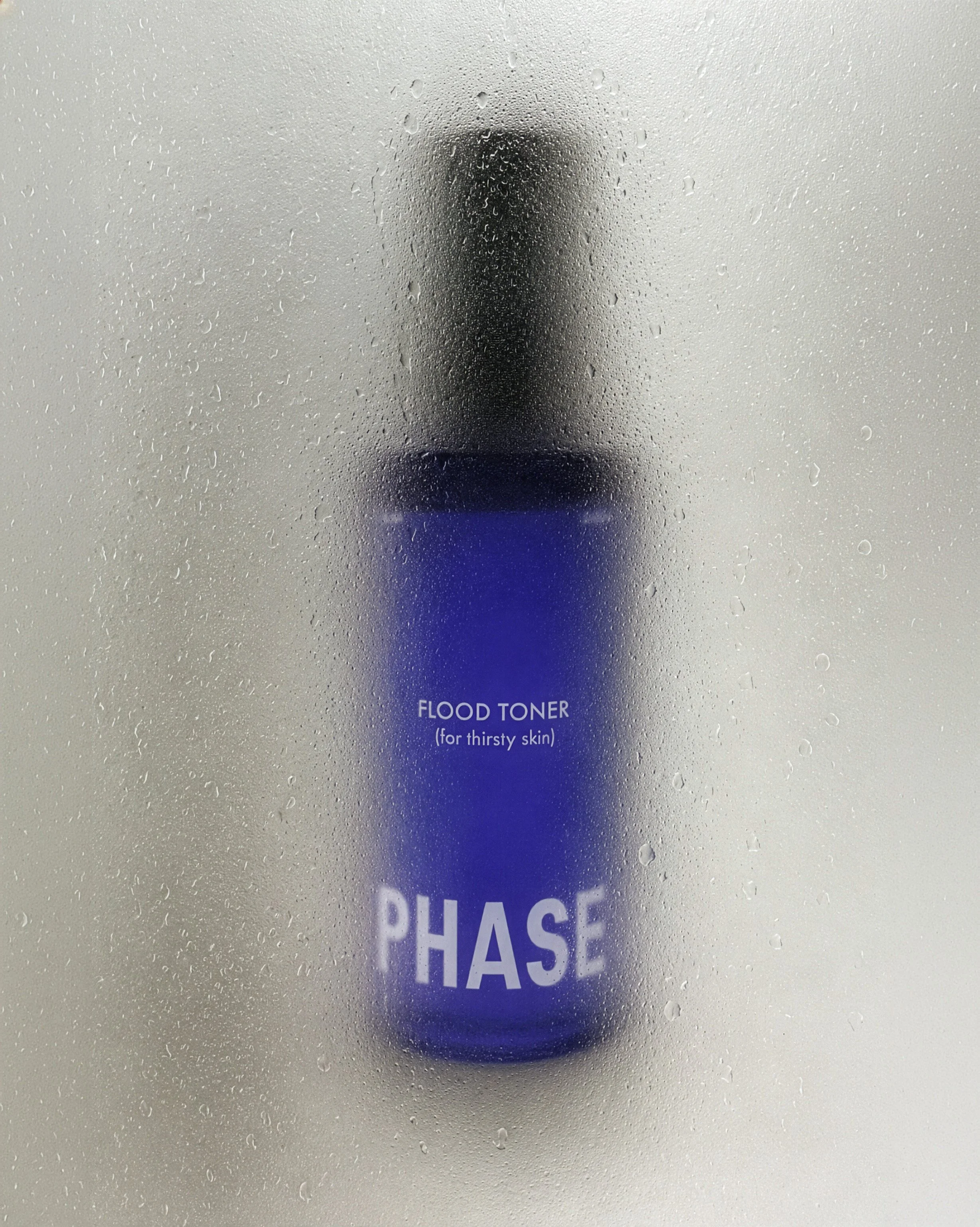
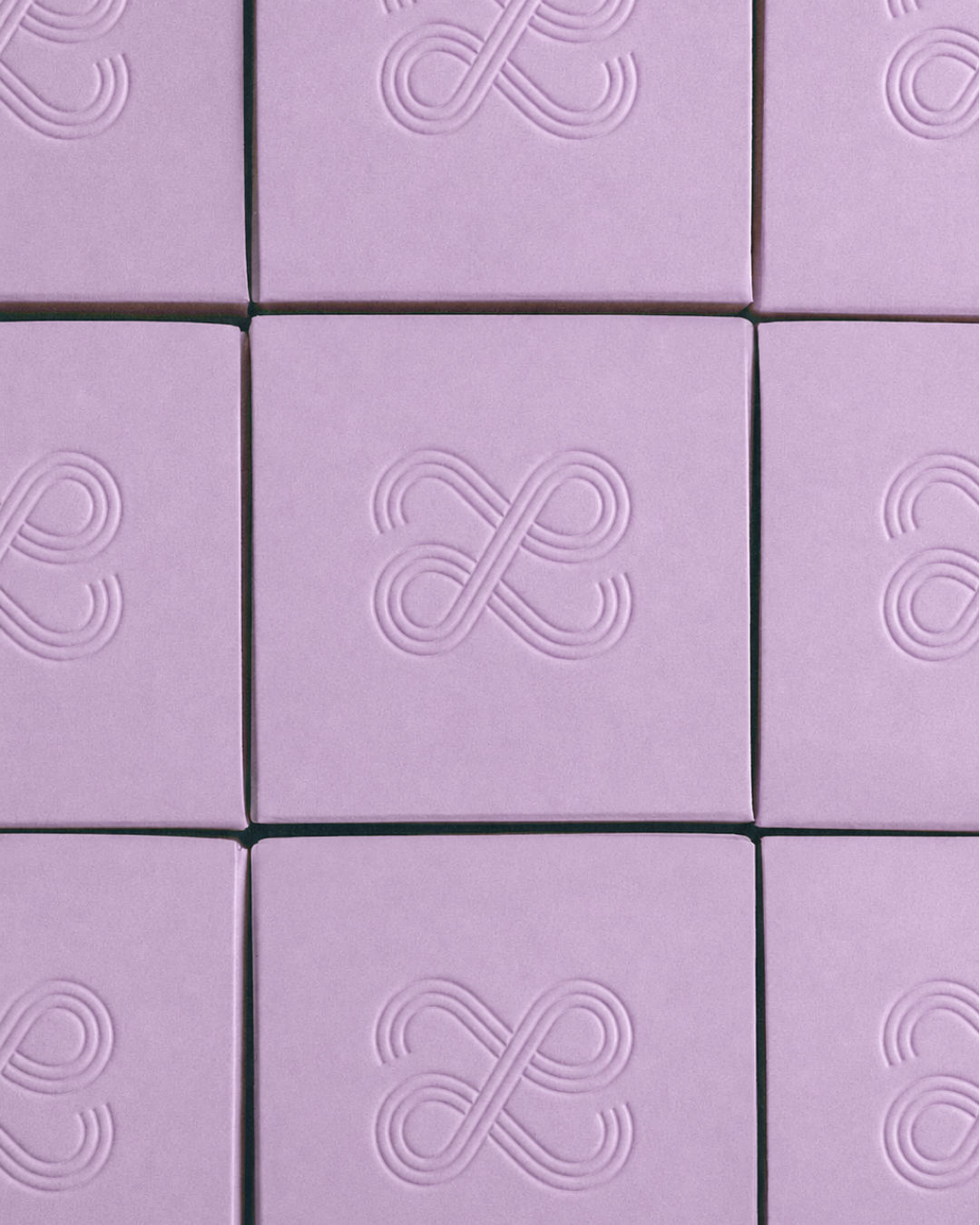
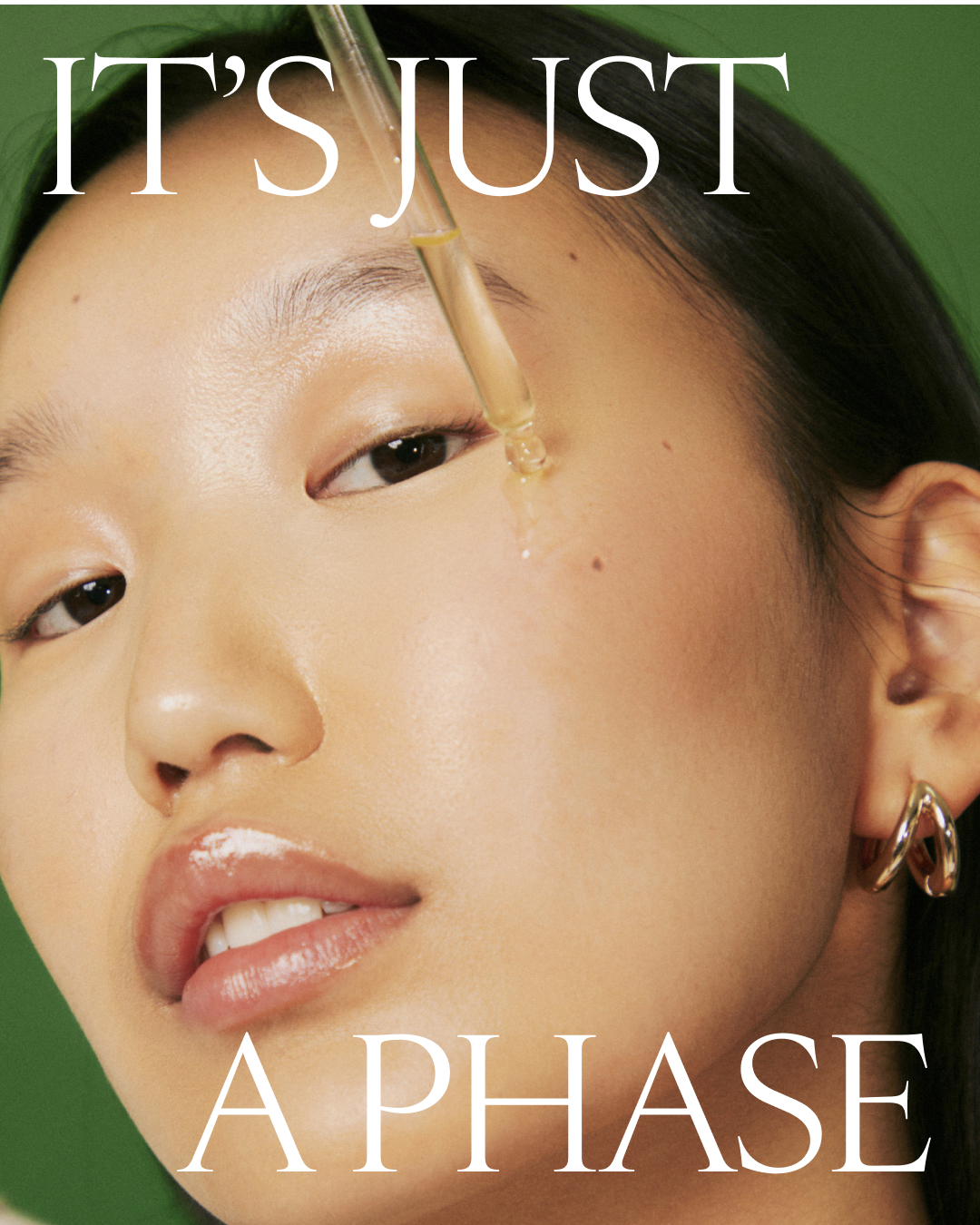
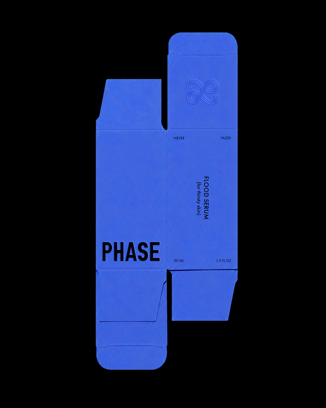
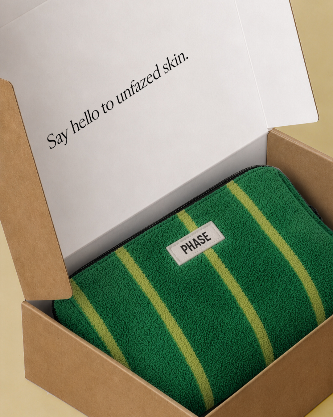
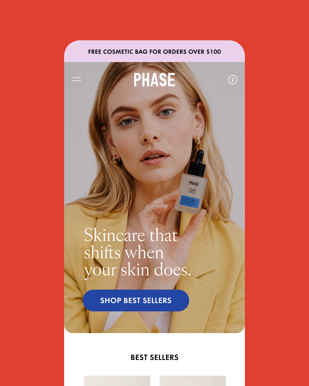
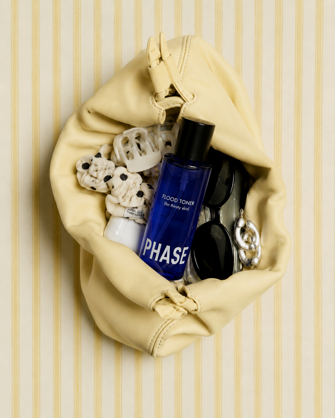
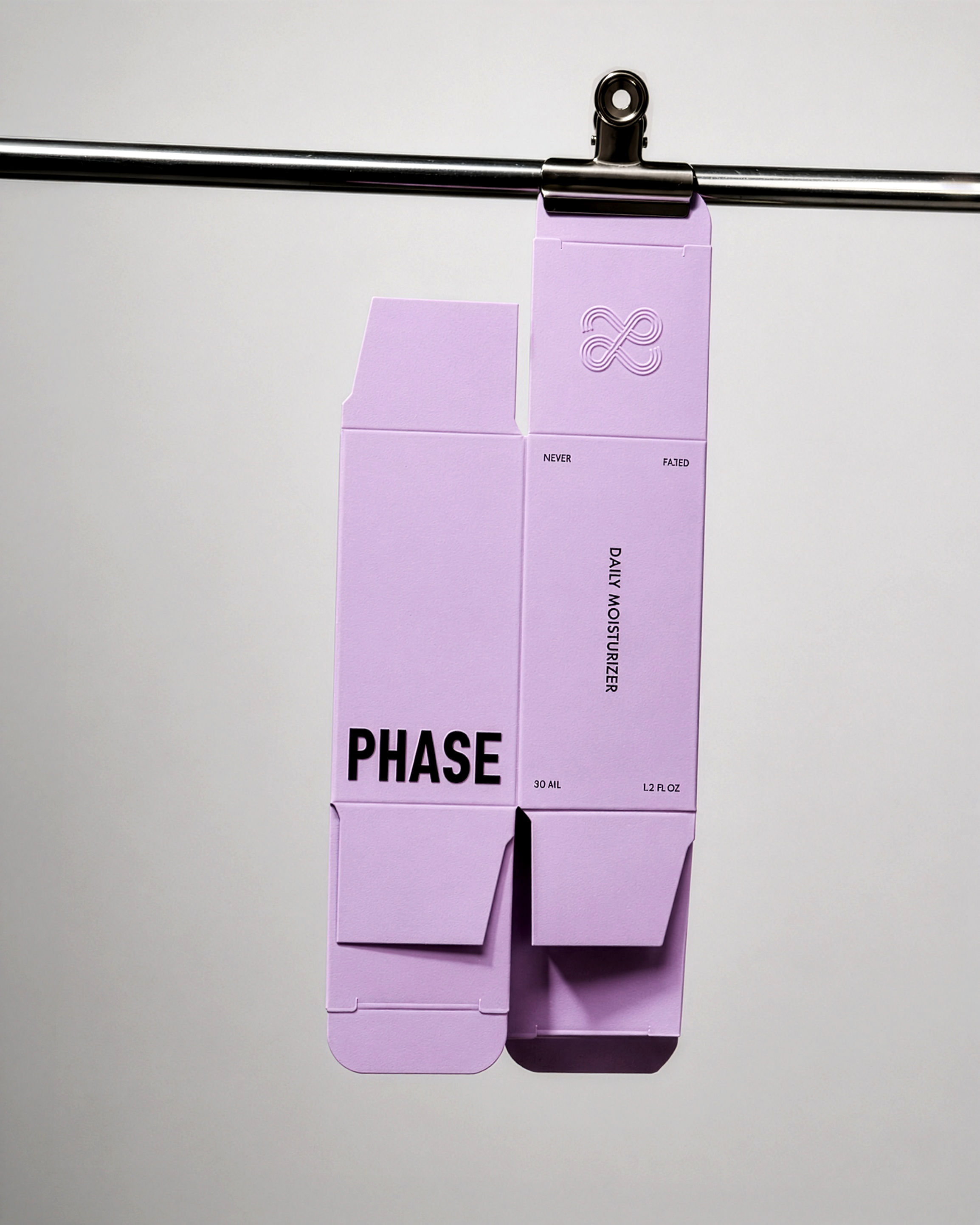
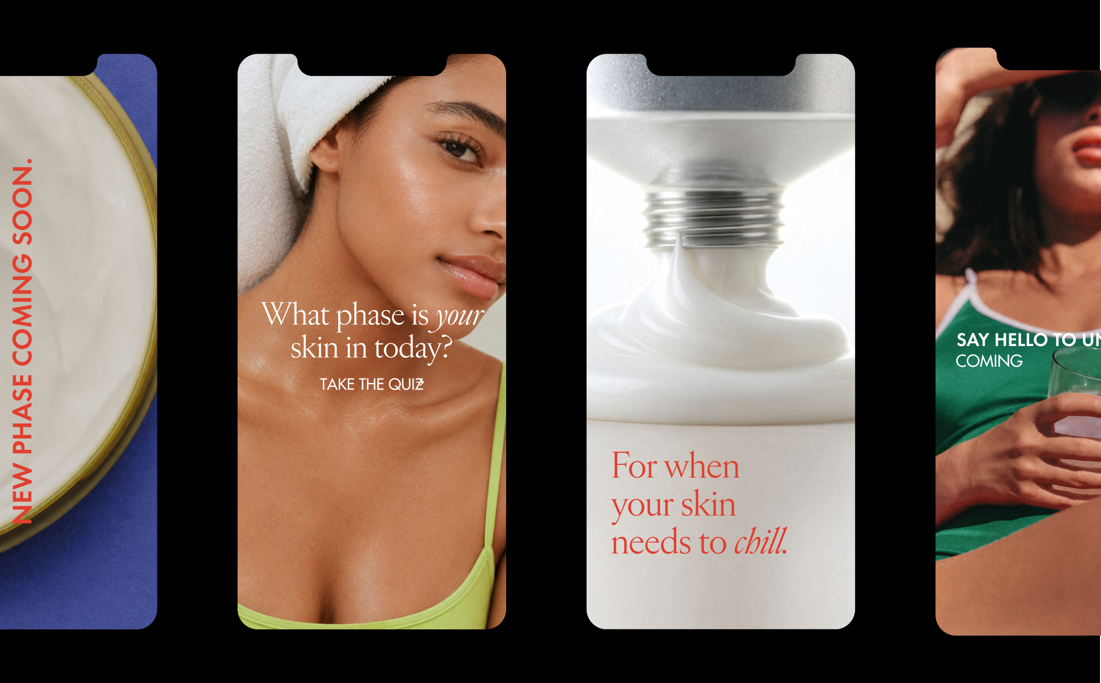
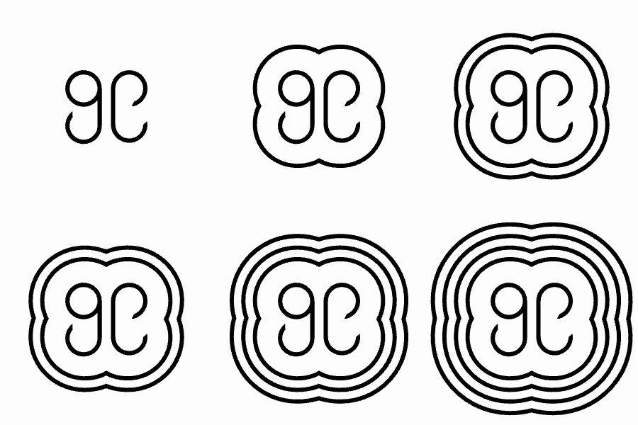
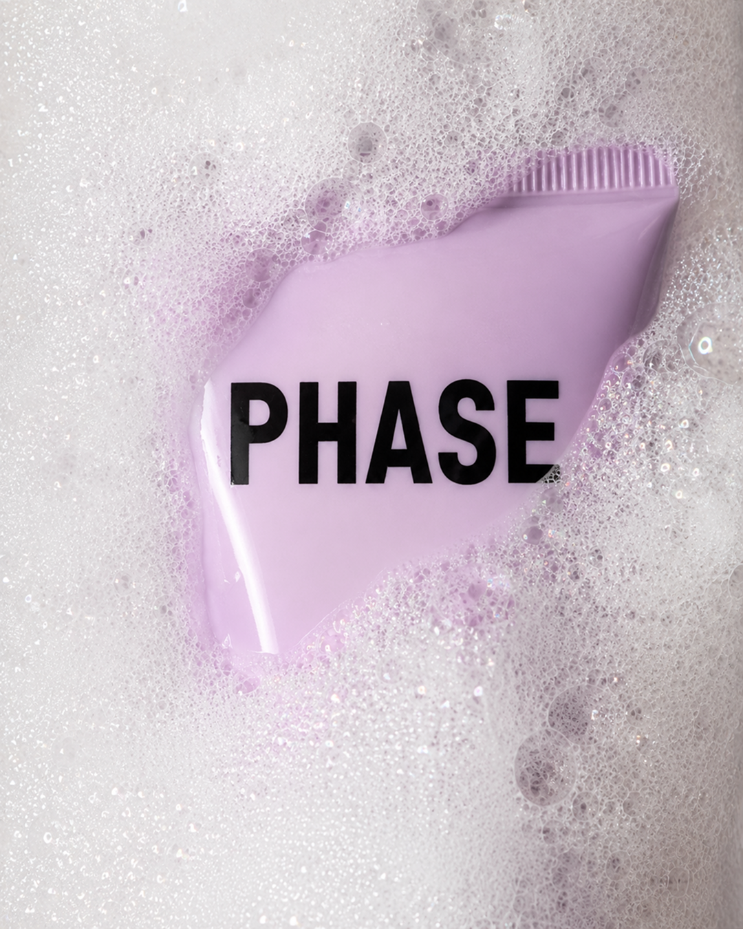
For most women, skin isn't one fixed thing. It shifts with hormones, weather, and stress, which means the routine that worked last month might not today. Phase started with that gap between how skin actually behaves and how most skincare brands still market to it.The challenge: most brands assume dry, oily, or combination as a permanent identity, leaving people to research ingredients and guess their way toward something that works. Women already carry enough mental load without adding a skincare degree to the list. Phase needed to replace guesswork with a system that was easy to understand and reliable.The system became the strategy. Instead of another ingredient-heavy line, Phase built a visual language around the phases skin actually moves through, borrowing inspiration from the NYC subway line and the clarity that comes with it. Color does the job of navigation: see the shade, know the phase, know what it supports. No label-flipping, no research required.That system carries into everything the brand touches. Where most skincare leans pastel and interchangeable, Phase goes bold, cobalt, yellow, green, lilac, red, each one a signal and a mood. Packaging trades the usual white bottle for frosted and tinted glass, silver metal, and black accents, with a single controlled pop of phase-color on each piece. Typography feels confident and modern, and the packaging is designed to look good sitting on your bathroom counter.What the concept includes:A full five-phase product and color system, each with its own color identityA packaging and visual language legible at a glance, no ingredient list requiredA voice built around unfazed, confident skin, distinct in a category full of soft, interchangeable branding
Phase turns skincare from something you research into something you recognize.services
Brand Strategy
Naming
Brand Identity
Packaging