project overview
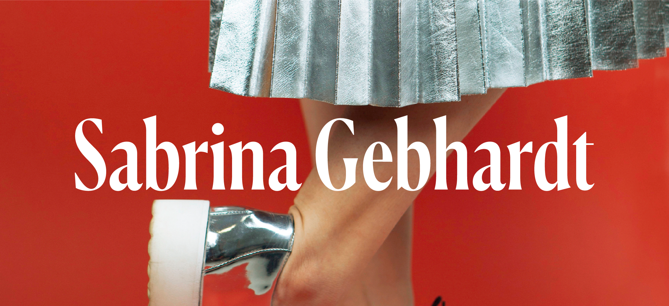
Sabrina Gebhardt
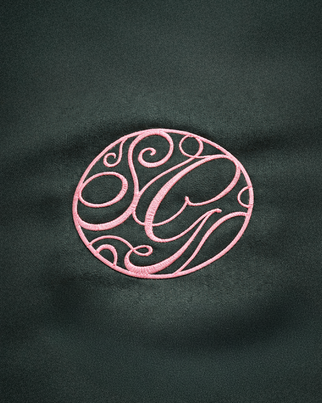
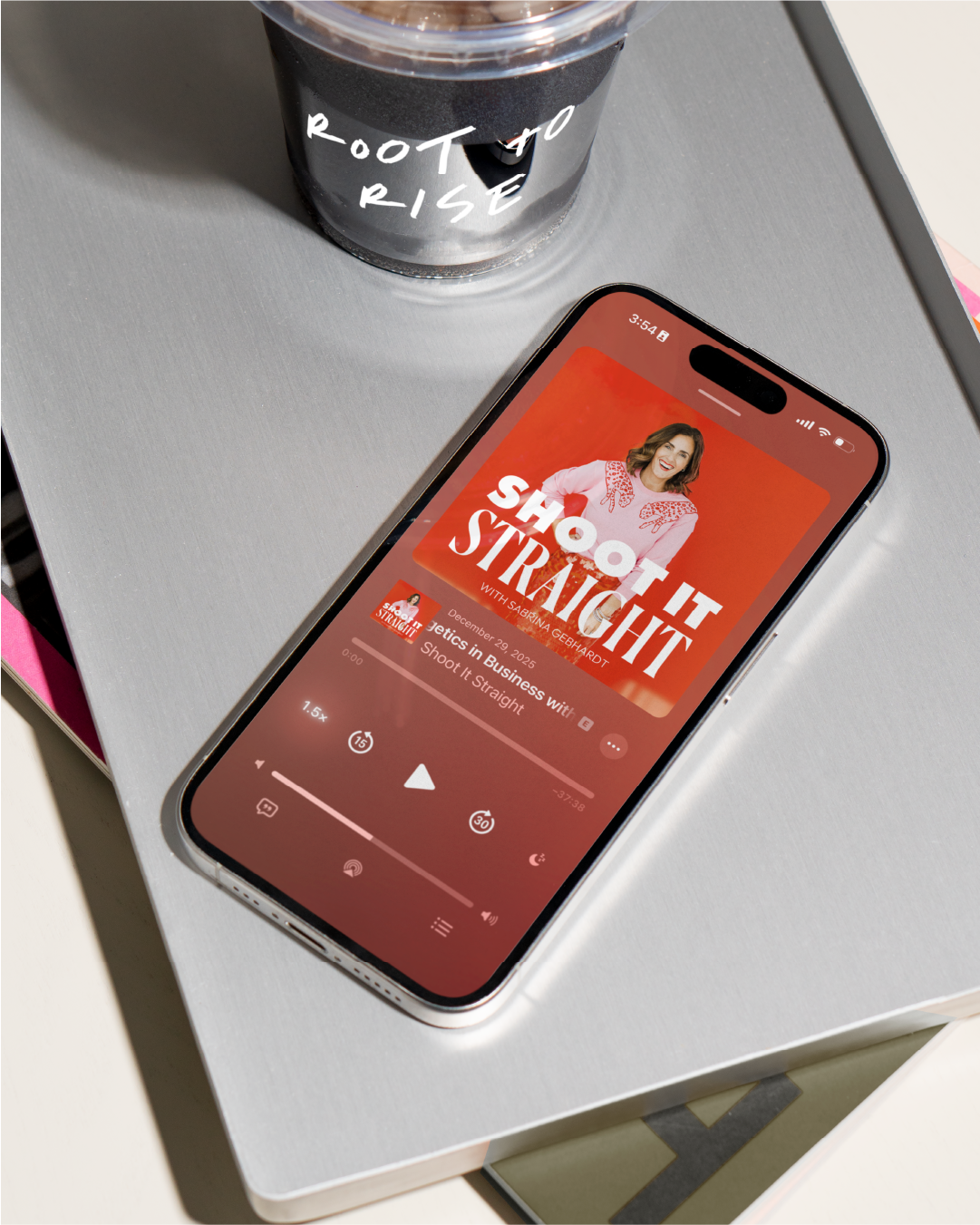
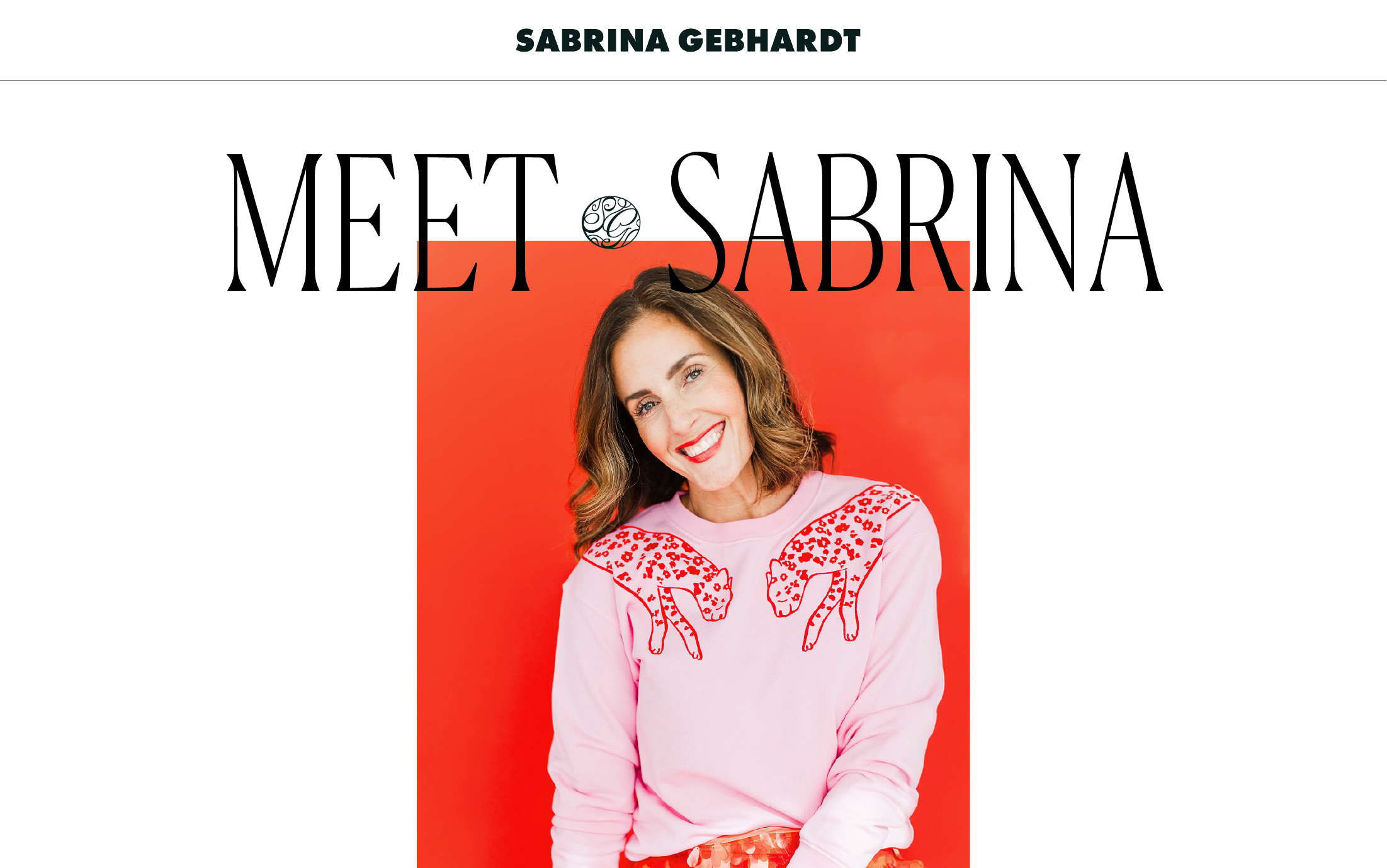
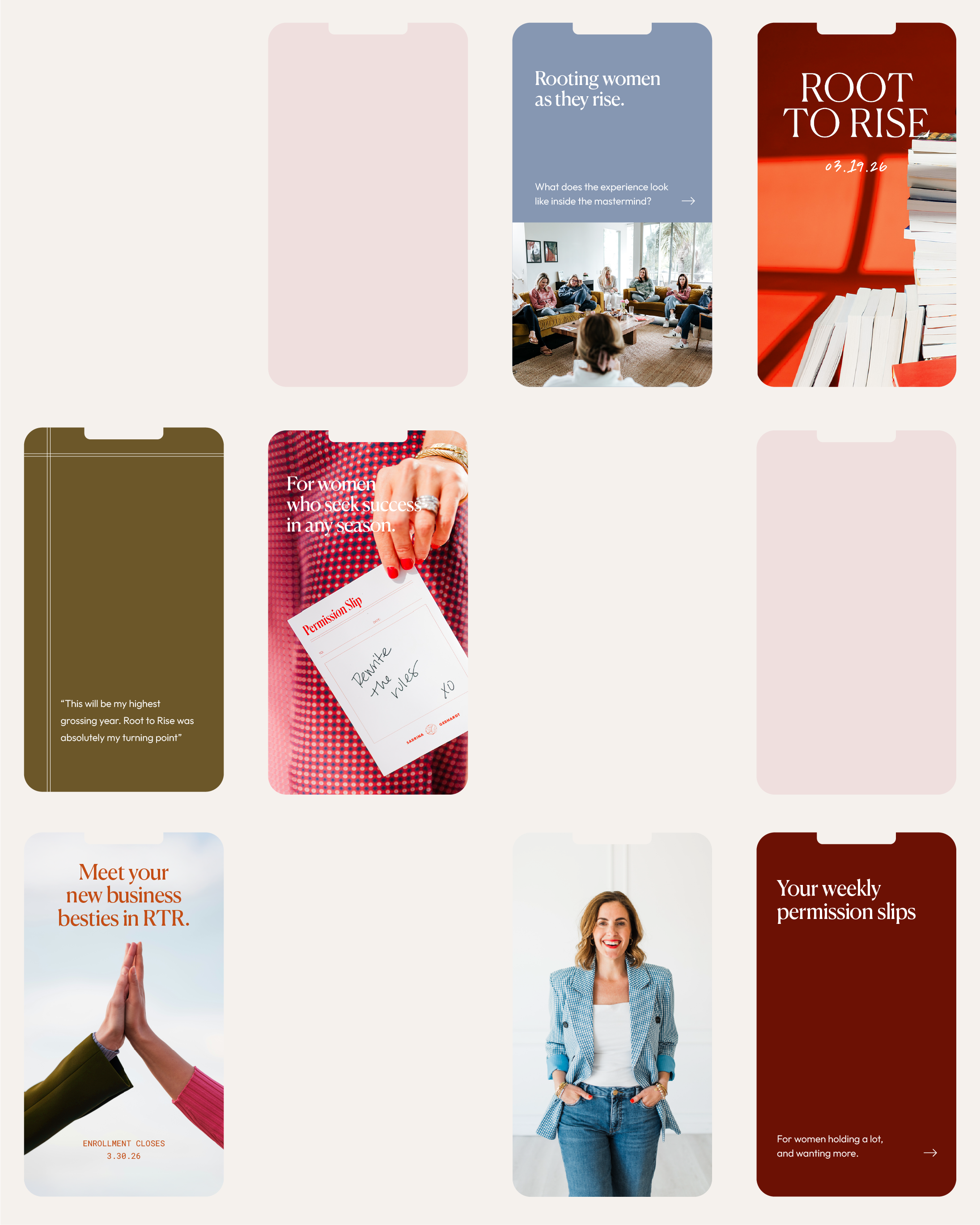
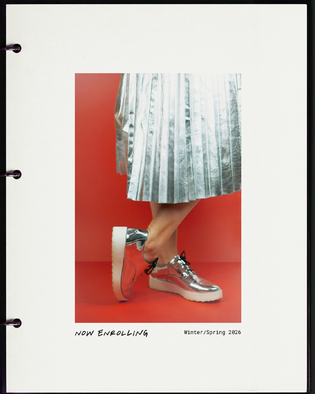
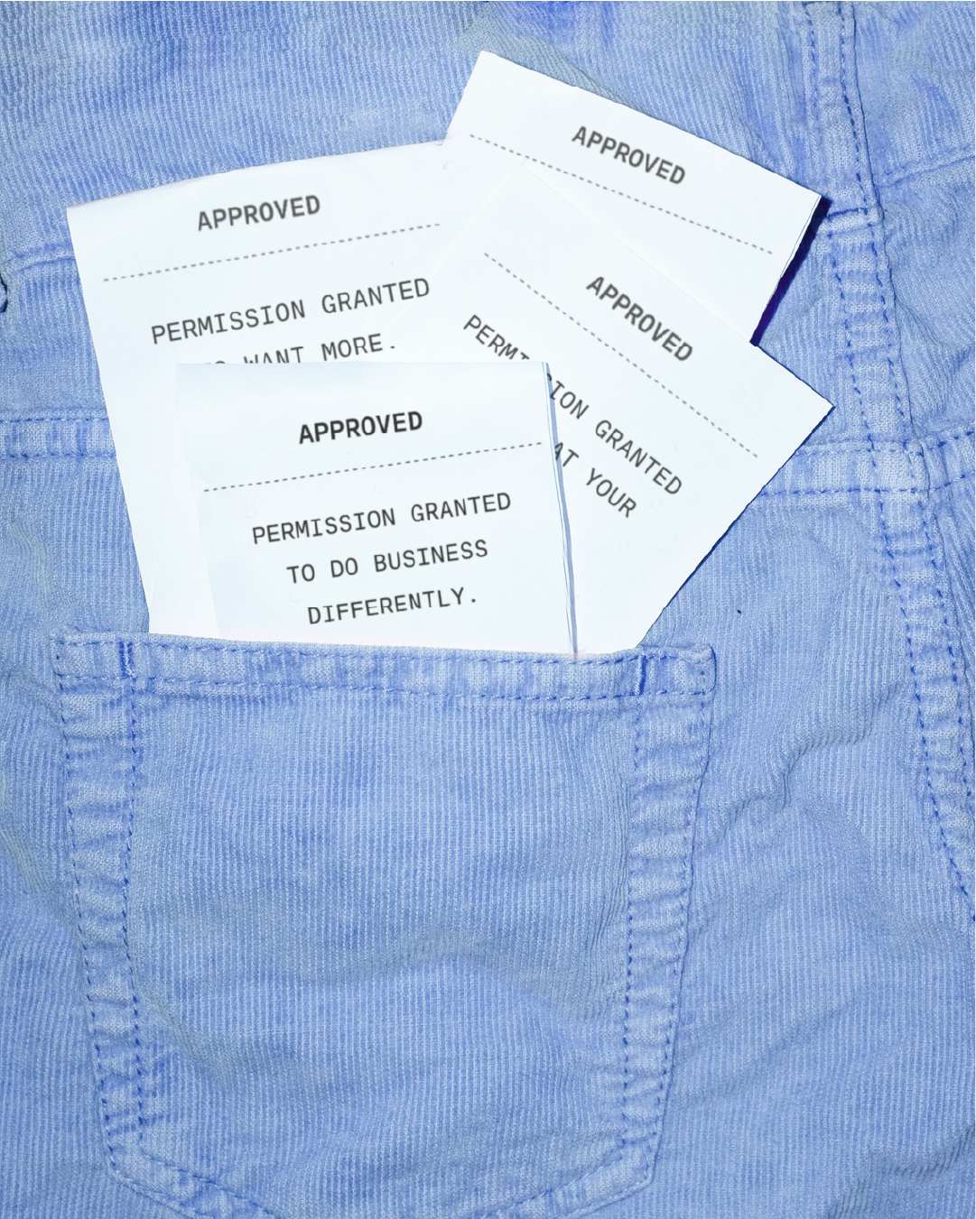
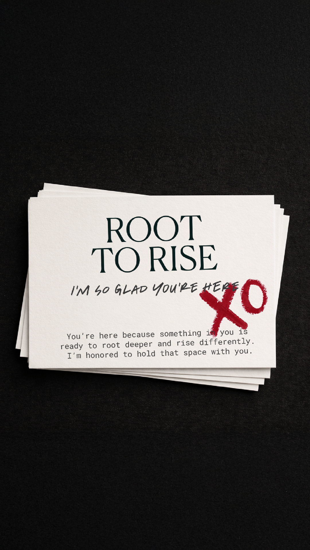
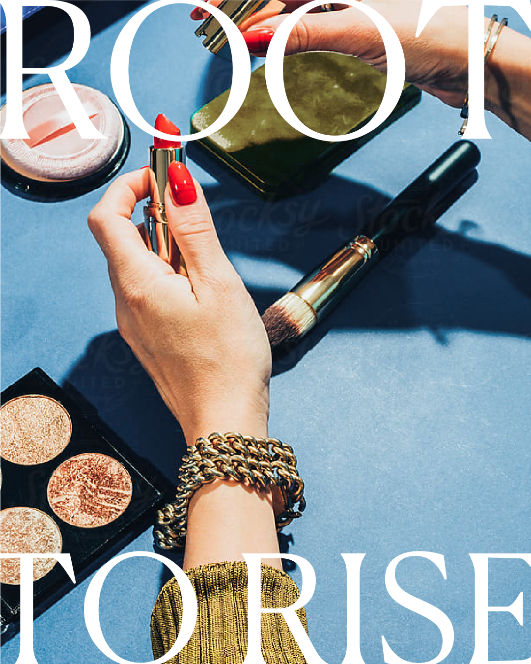
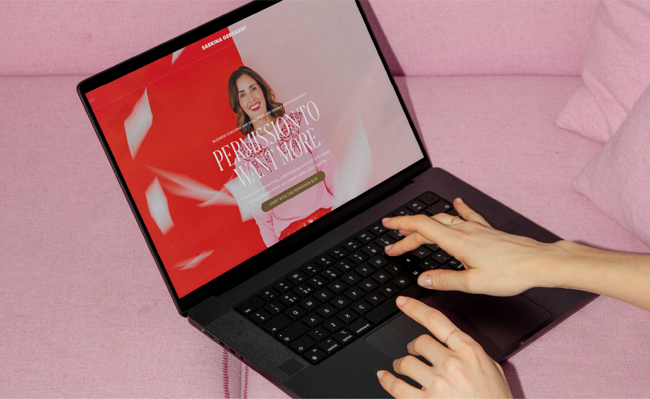
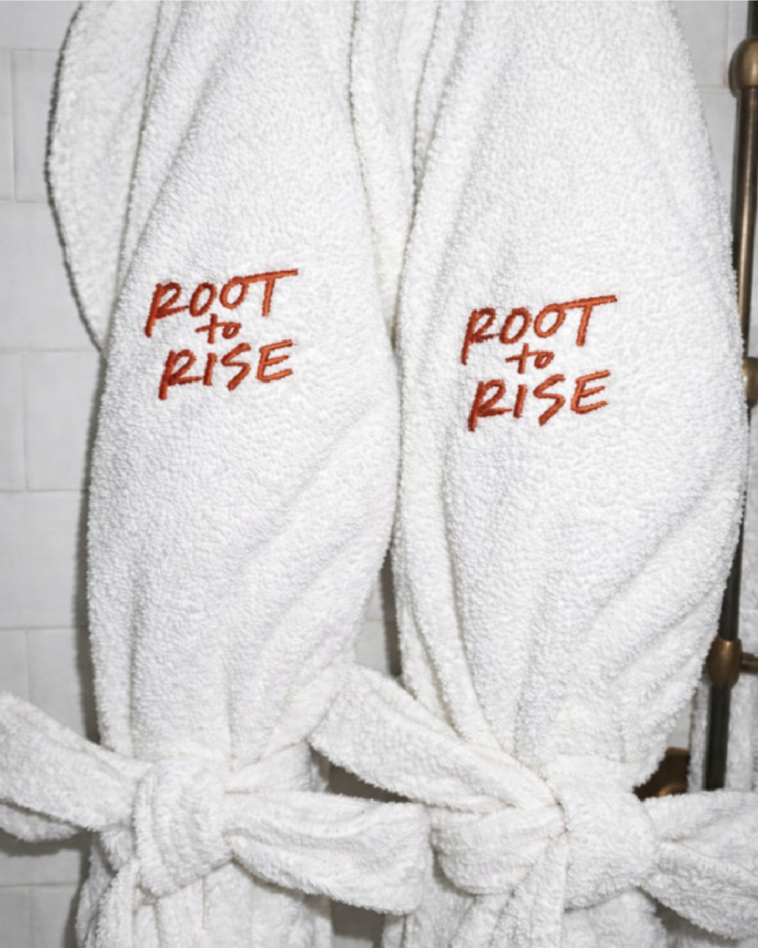
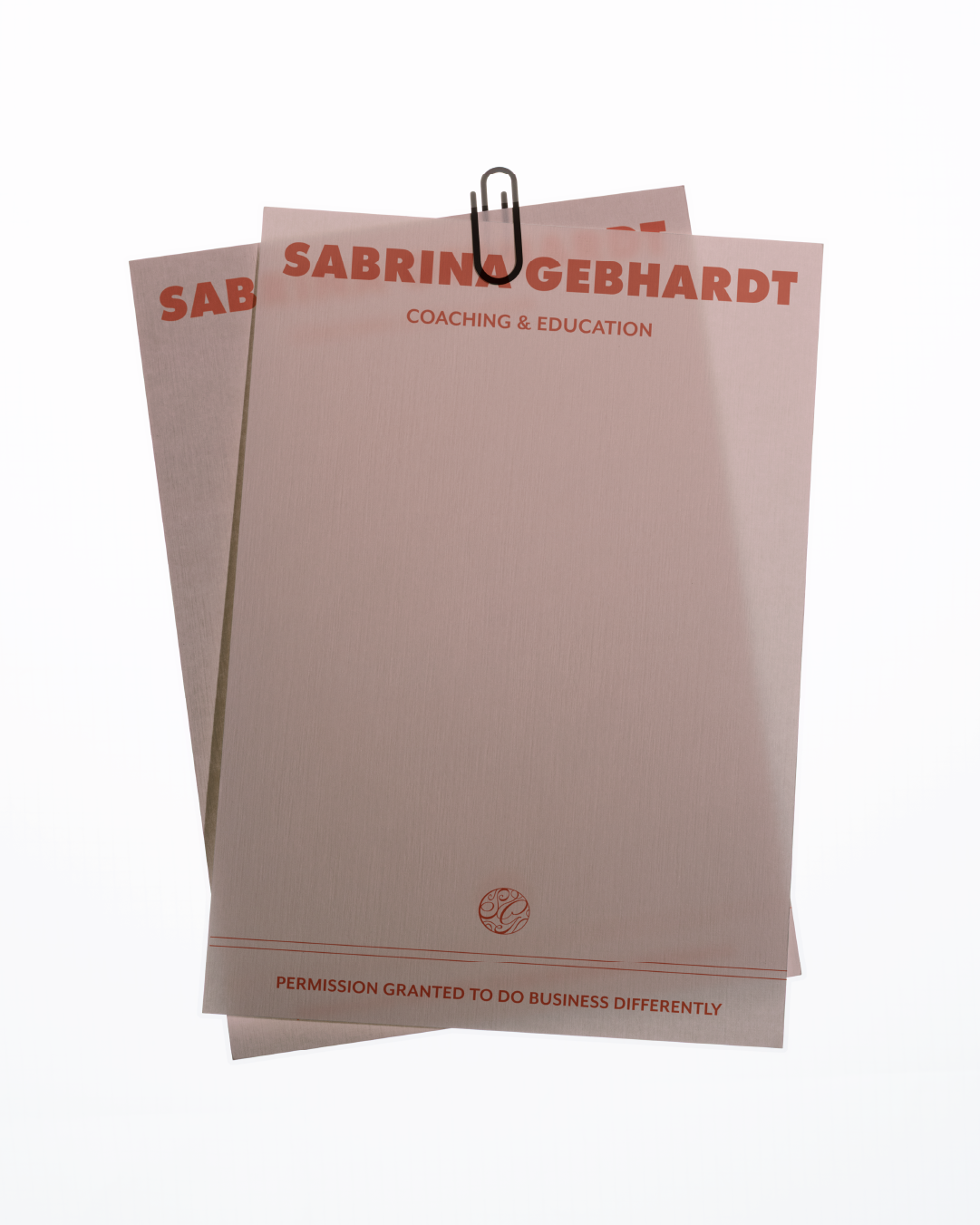
Sabrina came to us with a business already thriving, nearly a decade in, grown from photographer into full-time educator, mentor, and podcaster. What hadn't caught up was the brand. It had served her well once, but it had gotten soft, gentle, and tied to who she used to be, a version of her business that no longer matched where she was leading her clients, or herself.The challenge: evolve without erasing. Sabrina had a signature, pink, unmistakably hers, and she knew it needed to stay. But everything around it had started to read too small, too soft, closer to the overdone cursive-and-pastel look common across her industry than to the clarity and authority she'd actually earned. The goal was never to burn down what she'd built. It was to build on it with more confidence and scale.We started in strategy, pulling apart what Sabrina actually stood for versus what her old brand happened to say. What surfaced was permission, giving her clients permission to want more, to lead boldly, without abandoning where they came from. She rejects hustle culture outright. Her audience is largely women building businesses while raising families, and that tension, ambition without sacrifice, became the real throughline. It set the tone for everything that followed: warm, direct, a little bold, the energy of the cooler older sister who tells you the truth and still shows up for you.That positioning shaped every visual decision after it. We kept her pink, then built around it, layering in a confident orangey red, deep navy, dusty blue, and olive to add trust and grounding without losing her signature. Bold typographic pairings gave the system structure and scale, built to hold up across retreats, podcasts, workbooks, and stages, not just a feed. A handcrafted brand seal, developed from that permission theme, brought in a quieter, more archival texture, a small detail that let the boldness breathe.Her website was rebuilt from the ground up, from hundreds of disconnected pages into one clear path, built so landing on the site felt like getting a taste of working with her before reading a single word.Since launch, the impact has been immediate:Organic website traffic grew from around 500 to over 3,400 visitors a month, with weekly organic freebie signups that had never happened beforeHer brand is now instantly recognizable, sticking in people's minds long after they've left her site or scrolled past her feedMerch her audience wants to wear and be seen in, because being part of her world has become something people want to showA brand system built to scale across retreats, podcasting, speaking, and a growing mastermind, without losing the throughline that anchors itA community that's obsessed and loyal, and that recognizes her before they see her name
Sabrina now shows up with the clarity and confidence to match everything she's built, ready to keep leading her community boldly, without ever losing what made her recognizable in the first place.services
Brand Strategy
Brand Identity Design
Website Design & Development
Merch Design
Art Direction
Podcast Cover Art Design

"Before working with Cassie, I felt confused, lost, and honestly just very uncertain about my brand.
Three months after launch I emailed her a screenshot of my website traffic because I could cry. My organic traffic jumped to over 3,000 visitors a month, and I'm getting freebie signups every single week now, something that had never happened before.
People DM me all the time just to say pink and red make them think of me now. That's not something I had before my rebrand.
Her ability to drop into a person's brand and brain is unlike anyone else. It's like she opened a portal into the next level, and I never once thought the investment wasn't worth it."
– sabrina gebhardt
You've got the vision.
Let's give people something to gather around.